If in the previous article we discussed about the existing logo types, in this article we will discuss about colors. More specifically, we analyze the association between the colors of the brand logo with the field of activity and the emotions they trigger among the audience.
The right choice of colors for a logo design is decisive. Why? Because they help you to give more personality to the logo and differentiate yourself from the competition.
When a person thinks about a brand, the first thing that pops into their head are the representative brand colors – colors present in the logo of that brand. You can do an exercise and now think about Facebook, Pepsi, Coca-Cola, KFC, Instagram, Fanta. You definitely remembered colours first. We already know that an image provides more information in a shorter time than reading a text or hearing a name.
The impact that colours have on people’s emotions is decisive for your brand.
Understanding customer connections with certain colors may increase their desire to know your company and use your services or products. It is also worth pointing out that the emotions felt because of certain colors are answers to life experiences or cultural associations.
Be careful! If the colors are chosen correctly, they will emphasize the brand’s identity, but if you got them wrong, those colors would act against the company.
What do we mean when we say that your business may have to lose if the logo colors are wrongly chosen? Let’s think of a fast-food company logo and pick randomly two colors like purple and blue. Surely, when you see the logo, you will not think of a fast food, even if it has a graphic symbol, you will not link the logo to the field of activity. In conclusion, choosing the colors for a logo is a process and it’s not done only by taking into account your affinity for certain colors.
Below we will discuss some associations between colors and domains, associations made widely. There are no strict rules on the use of certain colors in the logos of brands that operate in certain areas, but rather relies on the potential customers response to certain colors. We will discuss in the following article how to choose and blend in these colors.
TLDR? Here are some handy pics with some info about the colors we talk about further in this article:
Blue
Blue is seen as a calming color, associated with masculinity, technology, peace, tranquility, freedom, intuition and trust.
Light blue shades are ideal for medical or hygienic companies that try to convey feelings such as tranquility and the idea of healing.
Dark blue is used successfully for corporate brands, offering a sense of confidence and professionalism.
Brands in the technology industry such as Dell, Intel, IBM, take advantage of the trustworthy message transmitted by the shades of blue. The message sent is that they provide products that customers can rely on.
Examples of companies that use blue in their logo are Intel, IBM, Skype, Facebook, Oreo, PayPal, Twitter, and Oral-b.
Even the automotive industry uses blue – an example is Ford, or blue along with other colors or non-colors – such as BMW, Hyundai, Subaru, and Hyundai.
Green
The green color, however, is a bit more versatile than the others. It is correlated, depending on its shades, with many more fields.
For example, dark shades of green are associated with prestige or the financial world, while the light shades are associated with harmony and freshness.
The light shades of green are associated with everything that is a part of nature, providing a fresh, natural, and regenerative feeling. It triggers feelings of balance, calmness, and a connection with nature. It is also a symbol of spring and new beginnings.
Companies that sell or produce natural products, companies that deal with materials recycling, and companies that support the environment through certain actions, we’ll use green in their logos.
If you want your company to be perceived as trustworthy, safe, sustainable, or environmentally friendly, you can choose to use green in your company logo.
Examples of companies that have chosen to use green for the logo of their companies are Razer, Monster, Spotify, Starbucks, and Heineken.
Red
Red is a primary color and may even raise up the pulse. Describes bold, intense experiences and associates with passion, love, energy, fire, danger, but also determination.
When we talk about its use in company logos, it is usually associated with power, energy, and resistance.
It is used in the logos of bold companies that are not afraid to attract attention and want to impulse their clients to make rushed decisions.
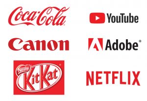
The examples are multiple. In the entertainment industry are NETFLIX, YOUTUBE, retail – Kmart, in the automotive industry – KIA, food industry – KitKat, KFC, Coca-Cola, and so on.
This color has the role, most of the time, to alert and speed up the process of taking a decision. For this reason, red is used for the call to action button, like “Order now” or “Click here” on many stores or websites.
Pink
It is considered to be, most of the time, the most feminine color. The pink color, however, is versatile due to the different pink shades. Brands that use pink color can describe energy and delight combined with a sense of calm, sensitivity, or politeness.
The pink color is a fun color. It is used to deliver positive energies, and it’s used in logos from industries such as the sweets industry, the cosmetics industry, children’s products, and even the telephone industry.
Examples are LG, T-Mobile, Avon, and Barbie.
Yellow
It is a warm color that inspires friendship, joy, and originality. It is used by brands that want to present to the potential customers a warm, playful, and accessible image.
The yellow color is known as a color that attracts customers’ attention, increases their spirit, stimulates mental clients, and represents optimism.
In general, it is used to represent products or services that are accessible and close to customers.
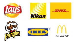
A few known yellow logos are Lay’s, McDonald, IKEA, Nikon, Pringles, and McDonald’s.
Golden
Golden is the color of brilliance, wealth, luxury, prestige, and it’s used by brands to show that their products are of superior quality for a particular customer group.
That’s why it works so well for luxury brands in areas such as beauty or fashion.
Some brands use the golden version of the original logo to highlight a certain line. Some good examples of this are Schwarzkopf and L’Oreal.
Chevrolet also uses a special golden tone for the company logo.
Orange
Orange is a vibrant, energetic, and friendly color. Revitalizes improves mood and causes impulsive purchases.
It triggers emotions like trust, creativity, determination, friendship, joy, and anticipation.
It is the right color for companies that try to convince potential customers to make a rush decision and buy faster.
It is also associated with companies that offer good quality services or products at affordable prices.
Entertainment, pharmaceuticals, family products, or baby care products can use orange for their logo with success.
Orange logos: Fanta, MasterCard, Amazon, TNT.
Orange is used for call-to-action buttons (“Order Now”, “Request Quote”) on many websites or online stores.
Brown
Brown color symbolizes seriousness, stability, support, and confidence. Most of the time, brown is associated with the color of the earth and wood.
It is often used by food-related companies, agricultural companies such as companies that are selling natural products, cereals, plant fertilizers, seeds, and so on.
One known example is M&M’s.
Purple
A perfect color for brands that try to offer an air of exclusivity, mysticism, sophistication, and even luxury, yet keeping a calming feeling.
It is often a color chosen for top brands, high-end retail companies, cosmetics, clothing, and children’s stores.
It works perfectly for companies that want to attract customers willing to try out a new and outstanding experience by using their products.
Purple color is a color that works for companies that target younger people. The older audience is not attracted so quickly by the purple shades.
Examples of companies that use purple in their logo are T-mobile, Twitch, Milka.
Let’s talk about White – Gray – Black
Black
It is seen as a symbol of professionalism, seriousness, elegance, and power. It is a strong non-color used in branding.
Companies that are choosing to use black for logo and branding want to make a strong statement and convey a sense of authority and respect.
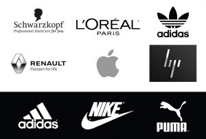
A few examples of companies that use black in the logos are Puma, Nike, Schwarzkopf.
White
White is associated with light and represents purity, efficiency, innocence, beginnings, and immaculacy.
Using it in the design of a logo will make it look minimalist and clean. Generally, it is used to convey the idea of new and fresh.
Symbolizes the immaculacy and sterility of products or services (hence the frequent use in the sanitary industry, children’s products, childcare) and the simplicity or the idea of luxury.
You can also use white to make the other color from your logo to look more vibrant.
It is often used as a variation of a logo that can be used on a dark background. A white logo on a dark background will surely stand out.
Examples: Milka (purple and white), Puma, Nike, Adidas.
Gray
Brands choose gray because it has a timeless, practical, and impartial character. It is used as a secondary or main color.
It symbolizes seriousness, efficiency, or mystery.
Silver
Silver gives a metal feel, and this is a feature of high-end, industrial, and technological things.
Using silver in your logo highlights the superior quality of the product and the company’s loyalty to the latest technologies and adds a luxurious atmosphere.
It is used in the automotive industry, technology industry, fashion, and beauty.
Examples: Renault, Honda, Mercedes, Apple, HP.
There are so many things to say about colors. In the next article, we’ll discuss how you can choose two or three colors for a logo. We’ll go through different shades, and we’ll discuss the way we use accent color or predominant color.
Conclusion – picking the best color
Depending on what feelings you want to trigger among the audience and the field of activity of your company, you can choose the right colors yourself or together with a graphic designer.
A transparent communication with a graphic designer will make it clear about what is your company beliefs and highlight them with carefully chosen colors and shades along with you.
The chosen colors will build the first steps for your brand identity, both online and offline. If you have a business at the very beginning – a startup – and want to launch your brand successfully on the market, we recommend that you have a branding manual that, if properly and fully designed, can help you maintain a consistent identity of the brand.
In need of some friendly advice or a premium and unique logo and a brand manual for your business? We can help. Contact us here.


 Orange
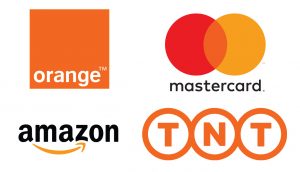
 Purple
 Let’s talk about White – Gray – Black