In the previous article we talked about what emotions can a color trigger among potential clients and how to choose a color according to the company’s field of activity.
If you have not read the article yet, you can read it here. Regardless of your company’s field of activity, manufactured and marketed products or services provide, you must have a legible, memorable, and easy-to-understand logo.
So let’s talk about choosing the perfect colors for your logo
No matter what type of logo you choose (lettermark, emblem, wordmark, brandmark, combination mark, and so on), it’s not recommended to use more than three colors. Too many colors will cause confusion. If you insist on having too many colors, nuances, or tones, you will not have a favorable result.
A harmony of up to three colors for a logo is more than enough. Don’t get carried away with colors. Don’t forget the fact that the logo should look good in black or white or gray-scale.
Remember that you do not choose a logo just for you. You choose a logo for your company and for its customers. That logo should attract them.
Just because it looks good to you, it does not necessarily mean your customers will feel the same way. Do not impose your personality in your company logo but try to give your company its own personality, with a logo that will be pleasant and easily memorized by customers.
When you start thinking about a logo or its colors, you probably checked out the competition in your company’s niche. It’s not recommended to copy the colors of top brands in your niche because you will give the impression that your company is just a cheaper copy.
But what combinations of colors can you choose for your company logo? We’ll take a look at more combinations in the images below and on the color wheel. Let’s get to it.
1. Complementary colors
What are complementary colors?
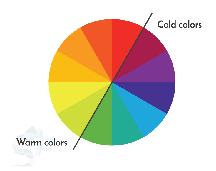
When the opposing colors inside the circle meet, then we have complementary colors. It works even better if we combine warm and cold colors like blue-yellow or red-green.
Warm and cold colors influence the emotions of a person. Warm colors such as red or orange tend to increase the pulse. Cold colors such as green, blue, or purple will relax emotionally. By combining two colors this way will result in a contrasting, vibrant, and effective harmony.
Using a complementary scheme for a logo is a versatile option. Why? Because you can choose to have a dominant color, or you can have an equal distribution of the two colors.
The use of two complementary colors within a logo is an option that will surely work due to the dramatic appearance that draws the customer’s attention.
Example: IKEA. Yellow draws attention, and it is used to represent products or services that are accessible and close to customers. Blue is associated with confidence, safety, and stability.
2. Monochromatic colors
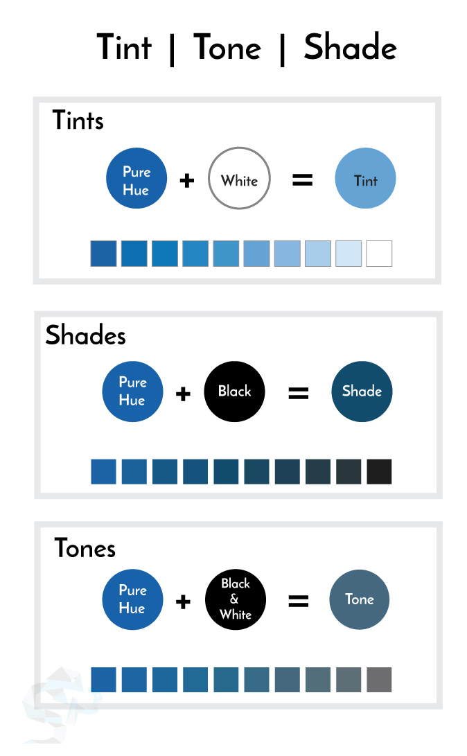
Even from the monochromatic term we understand that is the use of a single color – a single hue. We have different tones but are always derived from the same color.
Because we are talking about monochromatic colors, we have to point out that the colors also vary depending on the amount of gray, white, or black that is added to the basic color – hue.
From this idea, we can understand, very briefly, that we have:
• Hue: the color you perceive;
• Shade: when black is added, and the color becomes darker;
• Tint: when white is added;
• Tones – when grey is added;
As you’ve already seen, there are plenty of variants that you can find for any hue or base color. Of course, this shouldn’t convince you to use them all.
Even if you chose a logo based on a monochrome color palette, it is advisable to stop at up to 3 shades or tones. Too many shades will unnecessarily overwhelm the logo design, and at some point, the subtle differences between the tones or shades will no longer be obvious.
Logos designed on a monochromatic color scheme are balanced, harmonious and we’ll help the brand to be associated with a specific and memorable color. They are perfect if you want to accentuate the uniqueness of your company.
A good example is PayPal that successfully combines navy blue (darker blue) with sky blue (lighter blue). Using those colors they accentuate the idea of a serious company with professional services and they benefit of the trustworthy message transmitted by the shades of blue. The message sent is that they provide services on which customers can rely on.
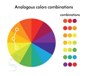
3. Analogous colors
Analogous colors are next to each other on the color wheel. Easy to use but not that contrasting.
Analogous colors combinations are more appealing than the monochrome options yet not as vibrant as the combinations of complementary colors.
Here’s a tip: if you’re going with analogous colors, be sure to think about a CTA (call-to-action) color from the start – why not pick the complementary color of one of your chosen analogous colors?. You’ll probably need one for your website, store or print materials, so it’s best to choose it from the very beginning.
4. Triad colors schemes
Triad colors schemes are combinations made from three colors that are equally spaced within the circle at a distance of 120 degrees one of another, forming an equilateral triangle. For example: blue, yellow and red.
The color triads bring a very attractive combination from a visual point of view. This type of color matching brings high contrast and maintains color balance.
Not as contrasting as complementary color combinations, but they do offer more balance and harmony.
Example: Burger King
5. Split complementary colors
The split complementary color scheme refers to a three-color scheme in which the base of the triangle is used to select two adjacent colors and the top selects a complementary color to the two colors chosen.
Using this combination will result in a contrasting aspect without having a high tension between colors.
6. Double complementary color scheme
A double complementary colour scheme is composed of two pairs of complementary colors.
It is difficult to work with because it directly implies four strong colors, and you can’t use them in the same amount in a logo.
In most cases you have to choose a dominant color among the four. There are, of course, exceptions to where you can use this combination.
The bottom line
A logo, in general, should not have more than three colors. There are exceptions from that rule as you can see the Google logo or Ebay logo. Both companies use a multicolored palette, and it’s working well because of the logo type. In these cases, the wide color palette outlines the brand message.
Depending on the type of logo chosen, and you can find a longer and descriptive article about this here, it is still recommended to respect the three colors rule.
Consider the emotions triggered among people by every color.
If you choose to use a monochromatic palette, you have to be extra careful at the differences between the tones. Differences must be obvious on printed materials or when you want to use the logo in smaller sizes. Remember that legibility is a must.
You should take into consideration the demographic data of your target audience when you’re choosing the logo colors. Data such as gender, age, or culture can have a huge impact on how your target audience perceives your brand.
Warm colors and cold colors on the color wheel
It is recommended to collaborate with a logo designer. An experienced logo designer will craft a logo that will successfully represent your company on the market.
By having an open and transparent communication with a logo designer, you will get the desired logo while getting the required efficiency among your audience. A designer will talk to you about your business, what message you want to send to the audience, what is your company’s focus audience, what products or services you provide, what is the image that your company wants to have, etc.
There are many factors to consider when you want to build a true brand that will pass the test of time.
All these discussions are to be considered because the wrong choice of a logo or a wrong palette for your company logo may cost you a lot. Let’s say that you have chosen a logo quickly because you think you need one and any logo will work. Nothing more wrong!
Your company will grow over the years, and you will find that your company logo does not represent your business successfully. Probably from the beginning you placed that logo on business cards, on street boards, on the car, on official documents, and on your company products.
When you decide to change that first logo with the correct logo, all of the above needs to be changed. That costs a lot more than if you had invested in a proper logo from the beginning.
Suppose you are in the situation where you need to change your company logo, then you will have to go through a serious rebranding process that involves a meticulous analysis. Re-branding has to be done carefully because you don’t want to confuse your existing customers while updating your brand image and making it more attractive.
Take good care of your company’s image if you want your customers to care about your products or services.
And if you’re looking for professional design services – logo design, branding, and well done graphic design, contact us here.