Logo design for fishing store
Representative and friendly
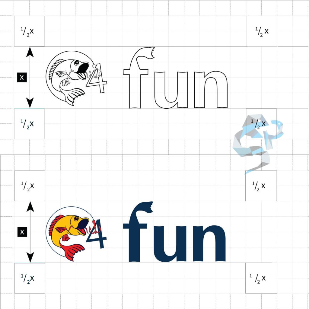
We’ve crafted a modern and representative logo for a store that sells fishing gear and apparel. The client requested a graphical representation of a carp frish and there were no specific color requirements apart from the fish looking as realistic as possible while being a vector. And that why we went with the specific positioning of the logo elements and the specific shades of yellow, red, and blue for this logo.

Professional, vectorial
To take things even further, we’ve modified the letter F and added a subtle fish tail to it, another aspect that kept things playful. The slight slant of the number 4 and the overall positioning of the represented fish allows the brand to take things even further in the future, like going for an animation or some other possible paths of ‘playing’ with the logo.
The logo also allows separating the fish for use in materials like the favicon, an app icon, as a watermark or other required uses where the full logo does not fit.


