
Label design for body butter and oils from Crisnatur
Design made to sell
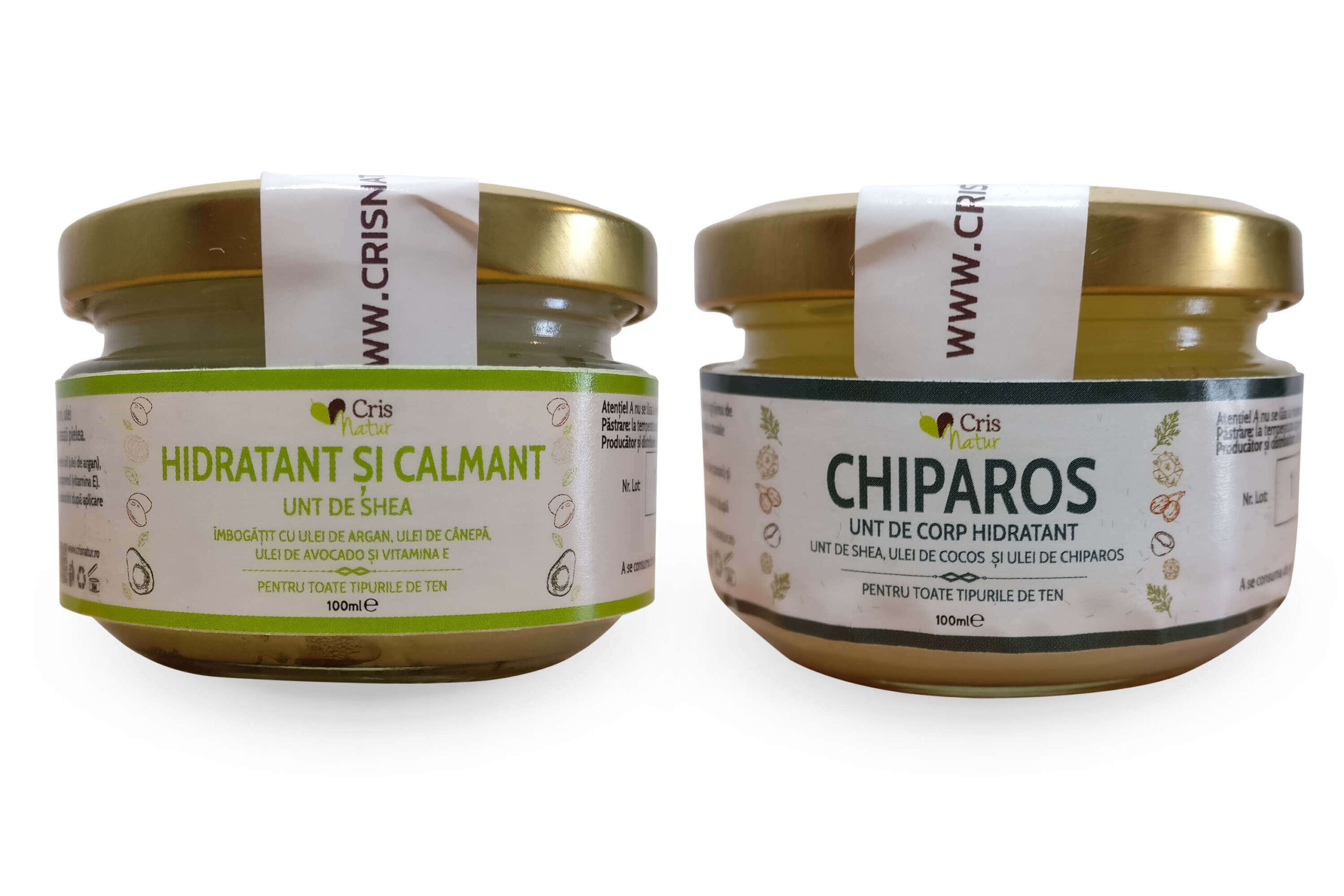
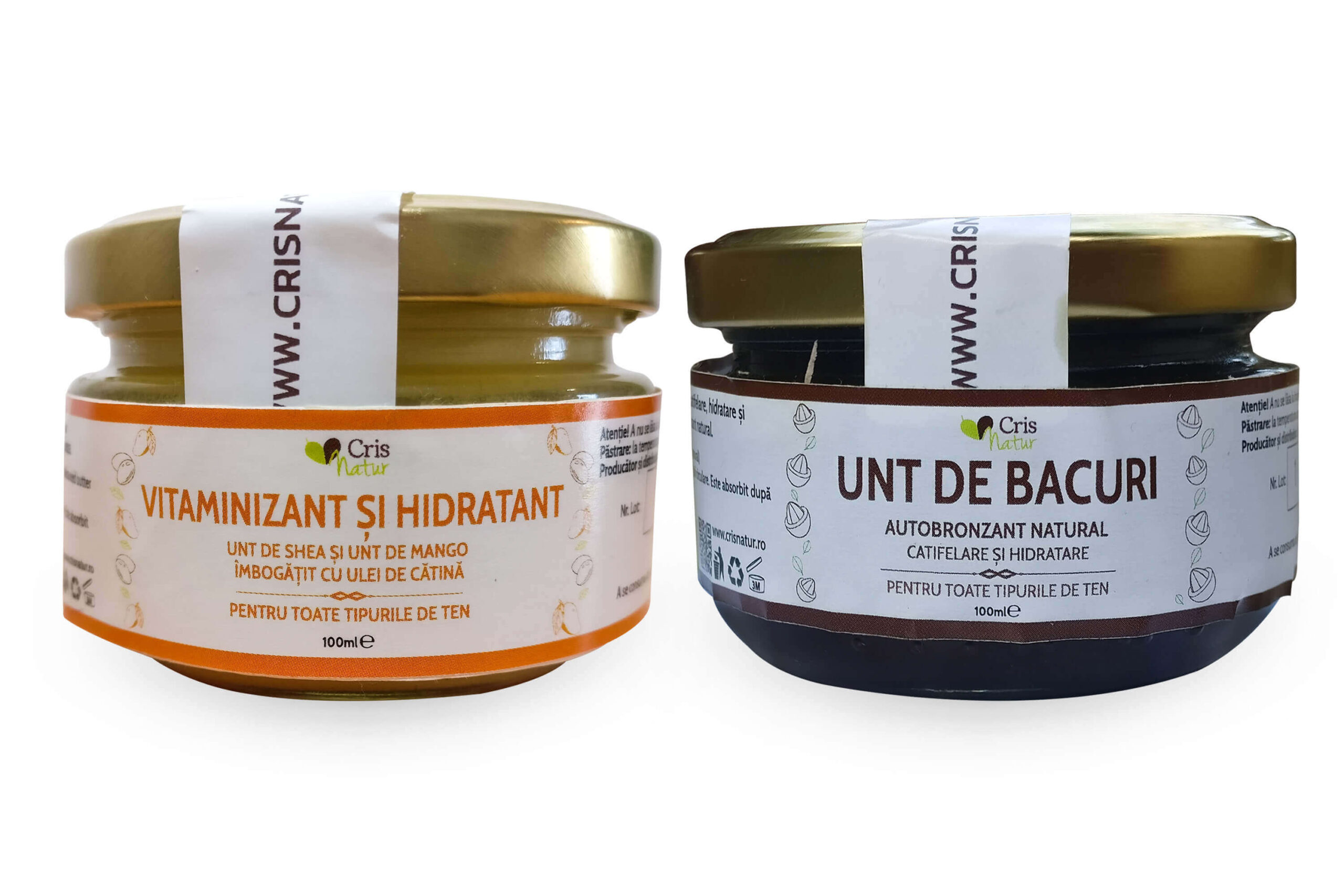
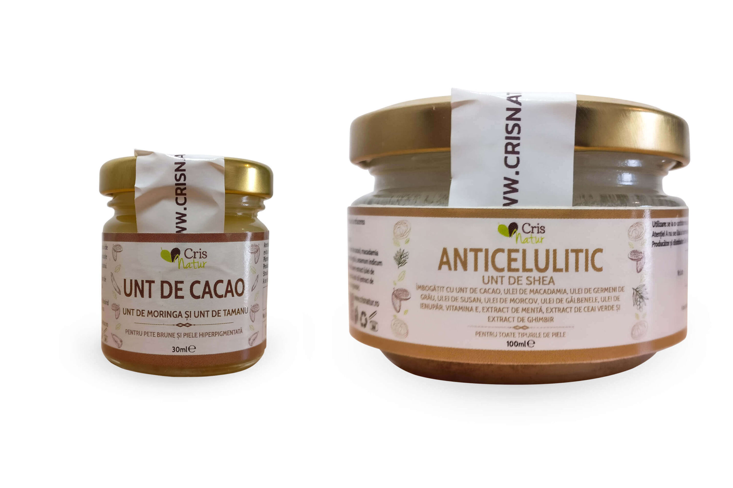
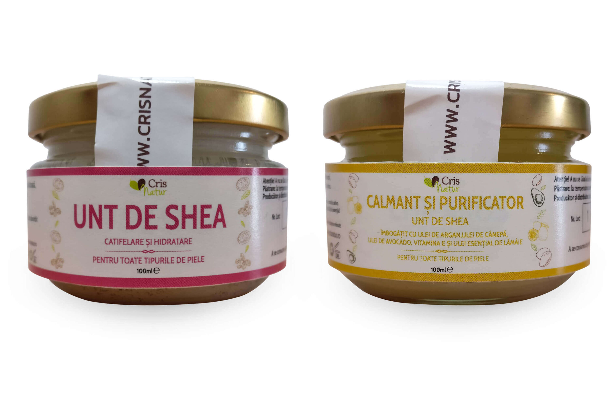
We’ve used personalized vectors and specific colors based on the ingredients, as key elements. They attract the eye of potential customers and help them understand the Crisnatur product range.
Their body butter is naturally made, and thats one of the reasons the client wanted a clean and classic look for the labels.
Each graphical representation of the ingredients was hand drawn, client aprooved and then vectorized for the label.
The graphics are joined by a strong typography to be as suggestive as possible for the customer – to make the customer understand whant kind of product he’s looking at and spark the desire to try the product.
- 100% vectorial design
- Hand drawn vectors from scratch
- Respecting the legal normative of the country
- Premium, pixel-perfect & unique

Suggestive design
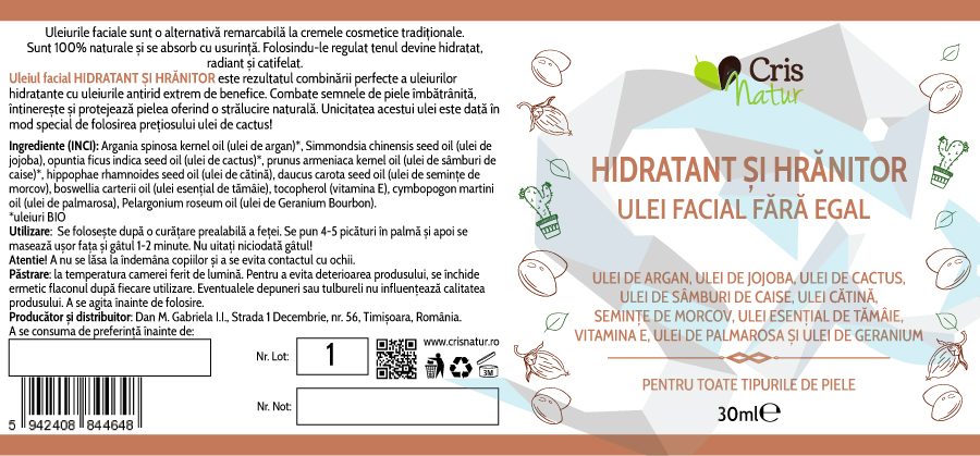
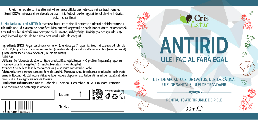
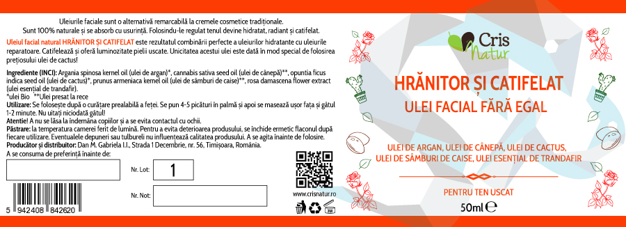
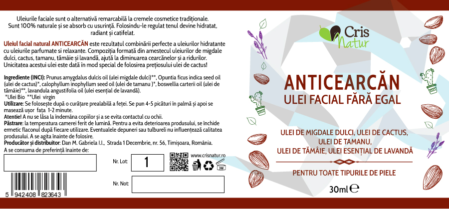
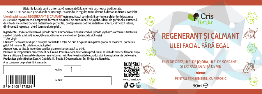
Following the same ideas and concepts from the body butter line, we also crafted the labels for Crisnatur’s natural oils product range. Having the same design concept in mind, the labels properly represent the main selling point of the products: premium, natural, and handmade cosmetics.
Each label was digitally delivered in print-ready formats: .AI and .PDF vectors. This way we can ensure that the end product will look sharp and clear, as well as having the possibility to resize elements as needed, without losing quality.
Unique vectors
Every element from the label is a vector, ready for print. This ensures everyone involved in the process that the final label, on the bottle, will look pristine. The fruits/ingredients present on the labels are each hand-drawn from scratch for this project.
Expressive minimalism
Even if minimalist, the design expresses the main idea behind the products very well: cosmetic products made from natural ingredients, made with passion and with the wish to increase the quality of cosmetics available in Romania.